Creating Versatile Buttons in Figma Using Component Properties
Written on
Understanding Button Hierarchy in UI Design
Buttons are among the most essential elements in any product design. They typically exhibit three levels of hierarchy: Primary, Secondary, and Tertiary (or Ghost), and can exist in various states such as enabled, hovered, disabled, and focused.
Since the introduction of component properties in Figma, designers working on product and design systems can now manage buttons within their UI kits more efficiently.
In this article, I’ll provide a file containing a button I developed in Figma, utilizing component properties and variants. I'll explain the rationale behind this approach, how it aids in maintaining a coherent design system, and what the file encompasses. For your convenience, a link to duplicate the file will be provided at the end, but you can also copy it directly from here to save time.
Why Opt for Component Properties?
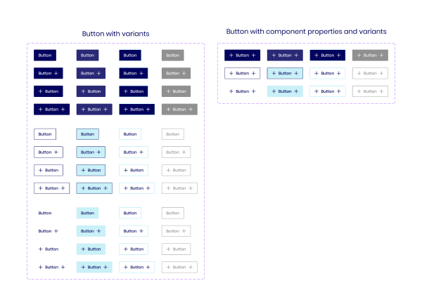
Prior to the advent of component properties, designers had to create a separate variant for every possible button configuration. For instance, I had to generate 48 variants to account for all options.
With the introduction of component properties, I was able to achieve the same outcomes with just 12 variants—a reduction of 75%. This not only simplifies maintenance but also results in a more organized UI Kit. Now, a designer can implement changes using just 12 variants rather than dealing with 48.
While it was feasible to automate the creation of the 48 components, testing each variant after library updates was cumbersome.
The Benefits of Component Properties and Variants
Initially, I believed that variants and component properties were unrelated features. However, upon reviewing the Figma documentation, I learned that variants are an integral part of component properties. This understanding is crucial for building comprehensive components that include text, boolean values, variants, and instance swaps.
Contents of the Provided File
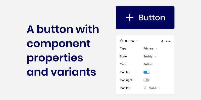
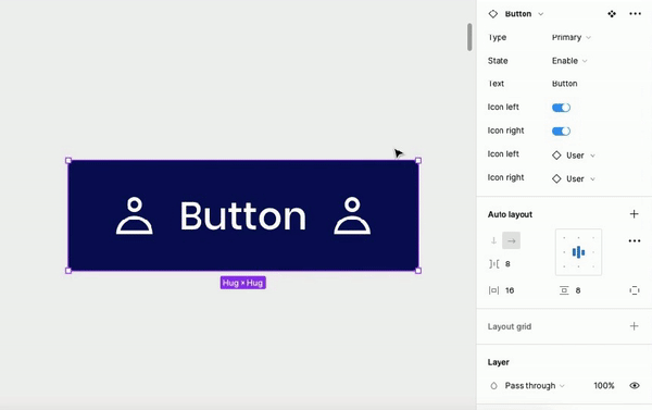
The file contains three button types: primary, secondary, and ghost, each featuring four states: enabled, hovered, focused, and disabled. Each button includes a text layer and two icons—one on each side—allowing for easy icon swapping based on your requirements.
How to Utilize the Component
- Select the desired button type.
- Choose the appropriate state.
- Enter the button label.
- Decide whether to include left or right icons.
- Swap the icons as needed. Keep in mind that you cannot swap an icon that is turned off; for instance, if the left icon switch is off, the ability to swap the left icon will be disabled.
Customizing Your Button Styles
Feel free to adjust the typography and colors of the buttons to align with your design preferences. Additionally, you can leverage your existing icon library to enhance the buttons further.
You can duplicate the file from here.
Enhancing Your Figma Skills
Are you looking to elevate your Figma abilities? Consider one-on-one tutoring with me! Whether you are just starting or want to refine your existing skills, I’m here to help you gain confidence and proficiency in Figma.
Ready to get started? Click here!
Thank you for taking the time to read this article. I hope it has provided valuable insights into using component properties for buttons. Please share it with your peers or team, and feel free to reach out with any questions.
If you found this article helpful, I encourage you to follow me and subscribe for updates on new posts. Interested in maximizing your Medium experience? Click here to become a member, supporting me and other writers in the process.