# Selecting the Ideal Corner Radius for Your Buttons
Written on
Chapter 1: The Importance of Button Design
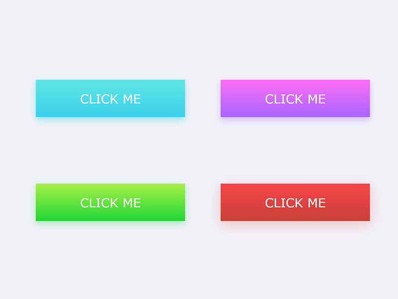
Choosing the right design elements is crucial for any project, especially when it comes to buttons, which serve as the focal point for user interaction. Every design choice, no matter how small, contributes to the overall user experience. Buttons represent calls to action and are integral to the functionality of any webpage. Thus, careful consideration must be given to their design.
As our understanding of user interface (UI) design has progressed, there has been a noticeable trend moving from sharp-edged buttons to those with rounded corners. Rounded buttons are often perceived as more visually appealing and modern, exuding a sense of optimism.
Quote: "Rounded corners can significantly enhance the interface's emotional impact."
Section 1.1: Corner Radius Options
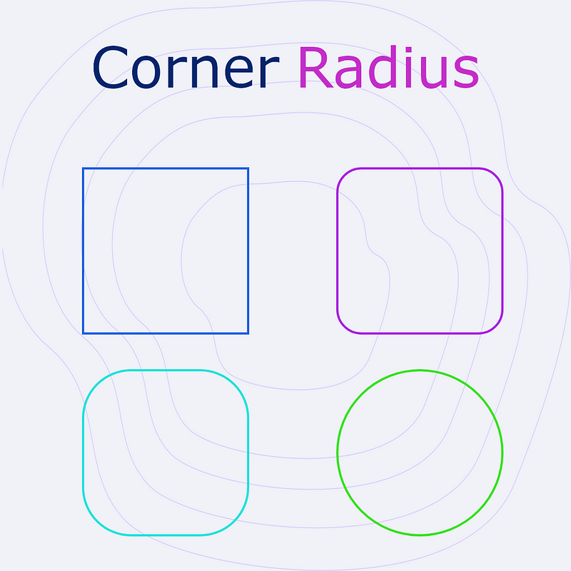
0px Radius:
This traditional style conveys a serious and professional vibe. Consistency with this sharp edge creates a clean aesthetic with precise geometric alignment.

Pros:
- Professional
- Clean appearance
- Organized layout
Cons:
- Conservative
- Corporate feel
- Lacks warmth
3–4px Radius:
This option strikes a balance between professionalism and friendliness. It is widely accepted across various fields, appearing more inviting than the 0px radius.

Pros:
- Friendly
- Professional
- Enhanced aesthetics
Cons:
- Conservative
- Lacks innovation
8–14px Radius:
Rounded edges work exceptionally well for card designs. They help differentiate individual cards, making them more visually distinct. Sharp edges can create a uniform appearance, causing the viewer's eye to gloss over the cards rather than engage with them.

Pros:
- Playful
- Trendy
- Innovative and eye-catching
Cons:
- Can appear messy
- May seem juvenile if not used properly
50px or Fully Rounded:
Fully rounded buttons excel when ample space is available, as they cannot be stacked like other button types. However, they serve as excellent call-to-action elements, effectively guiding users' attention to specific actions.

Pros:
- Friendly
- Creative
- Visually impactful
Cons:
- Not suitable for all calls to action
- Can resemble tags
Chapter 2: Practical Considerations for Button Design
When it comes to selecting button designs, there is no one-size-fits-all solution. Design is inherently flexible, so leverage this to your advantage. Ensure that your choice complements the overall design aesthetic. If possible, conducting user testing can provide valuable insights. Ultimately, the goal is to create buttons that entice users to click.
Video Description: Explore the debate between rounded and sharp-corner buttons, and understand how each style influences user interaction.
Video Description: Learn how to effectively use rounded corners, independent corners, and corner smoothing techniques in Figma to enhance your designs.